 Login as
Hi! This is Adrian at Web Analytics Consultants Association.
Here’s an interesting read on how to make the most out of your PowerPoint presentations and express your ideas with effective clarity.
Getting your message delivered in a cluttered world
In today’s world of data driven marketing and all things big data analyzed, people often forget how important visualizing your results and delivering them in an easy-to-understand way is. This is mainly especially so in about every culture where the actual presentation of results tends to often be an after-thought in a big mesh of words and other gibberish put on PowerPoint.
While PowerPoint is used worldwide over 350 times every second for presentations, it doesn’t have to be the end bucket where you throw all your results in hope that somebody somehow pays enough attention and is able to figure out what you are trying to say.
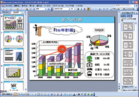
For the longest part of my 15 years in Japan I have seen PowerPoint slides that are heavy loaded with text, have no visuals and when it comes to showing graphs, all they have is slapped-on Excel bits and pieces all over. It is also needless to say that there’s also no narrative in place.
Well, we are different
Or so most people generally say when it comes to justifying this behavior. “Japan is different and we have to do things in a Japanese way.” Now, what way are we referring to? Having traveled the world and seeing human beings behaving as such, I can say that Japan is not any different than any other nation in its league and while Japanese language provides for 70% more content absorption than its counterpart roman-based languages, at the end of the day, there’s no particular reason to make your audiences bored and trouble the delivery of what you want to say or better said, show.
Think, think and then….think again
We are all marketers, analysts, business owners or somebody else who has a reason to present things regularly and usually on PowerPoint. When it comes to marketing and especially data results, some people seem to have forgotten that delivering the message should be as easy as arriving to the conclusion that drove the need to create the message in the first place and not a new issue to deal with.
So, let’s see what it takes to make a change and move away from the “we are different” to the “we can be as effective” kind of situation.

Your audience listens to you for about 8 minutes. If you don’t capture their attention and effectively entice them to listen to what you have to say, they will become bored and eventually fall asleep. There are no excuses and the time of the day you deliver your thoughts has nothing to do with this.
By the 10th minute you are in danger and it is then when your audience attention takes a nosedive. You MUST avoid boring your people.
First thing to do to avoid running yourself into a complicated situation is to Be your audience. Put yourself in their shoes and think whether what you want to tell them is something that will interest them as much as it interests you. In other words, think about whether you have a story to tell and if you don’t have it, make one.
Take time to outline the kind of message you want to deliver, to whom, and how much time you have to deliver it.
Here are a few essential pointers to this effect.
1. Create an outline
When you want to drive somewhere you usually have an idea of where you want to go, you just don’t get in the car and drive. Making a PowerPoint presentation is the same thing. Don’t just open the application and start slapping things on slides. In fact, you should not open the application until you have an idea of what you want to present on paper. Jot it down, sketch it, write it, use what works best for you, but first have an idea. PowerPoint is a vehicle for delivery and not the delivery itself.
2. Target your people
Chances are very high you know who’s going to be listening to your presentation and you must tone the message for them.
For example:
a. If you are talking to executives you will deliver your report in a business like manner.
b. If you are talking to peers, you will talk at the same level.
c. If you are talking to marketers (and if you are not a marketer) you will speak their language, or at least learn some of it.
d. And so on…
It could be that you have a mixed audience and for them you must have a wide message. What is certain is that you will always know something about your audience and never have to deal with people you don’t know at all.
3. Know the stage
This is often and generally forgotten. Presenters tend to think that by way of standing on a stage they will automatically deliver a good presentation. This simple and yet important fact is often a reason why things can go wrong at the time of executing your presentation. Get as much as you can from the stage you will present. Whether it is a presentation room at your company or a big stage at a world-class event you can always get to know the physical location you’ll have to deliver your message.
Go and see it. If you can’t see it for whatever reason, get information from somebody who has it. If all fails, just google it. Chances are somebody has been there before.
4. You are the star
Yes, this is correct. You are no more and no less than the star of your presentation and must deliver it as such. You must elevate yourself to the point at which you are in a star position and failiing to do so will ruin your message.
Your audience is there to listen to what you have to say, but more importanly they are there to listen to YOU and nobody else.
Beyond the basics
Now that we know that thinking and planning is important for good delivery, let’s see what it takes to actually stepping out of the mess and making a good presentation that lives up to the promise of YOU being the STAR of your message.
1. Repeat, yes repeat
Again, repeat. Repetition commits information to long-term memory and this is the first thing you have to do if you want people to listen to you longer than 8 minutes. This doesn’t necessarily mean that you have to say the same thing over and over again, what it means is that you have to reiterate important points within the context of your presentation so that they are remembered.
Find the important takeaways of your message and deliver them in a manner that stay in the audience’s collective mind.
2. Be memorable
In other words, make sure people remember YOU for what you say and how you deliver it. Your presentation must be clear, educational and attractive, but more importantly it must have elements that make your message and data stand out.
For this particular part there is specific action to take. Very important to curve the “we are different” mentality tha can potentially justify wrong behavior.
a. Loose your bullets
It is often a common mistake to express everything in bullet points. More often than not, people open PowerPoint and start loading slides with bullet points.
You are the only one who wants to see bullet points. Your audience doesn’t.
While it is true that you need some bullet points, too many of them can lead to confussion, clutter and contribute to an unclear message. Before bulleting your lists, think about whether you really need to have bullet points on a slide to express your ideas.
b. Visualize
Instead of bullets, you can use nice imagery to express the same ideas in an easy way and convey one idea per slide. Arguably, you may tend to think that by way of doing this the slide count of your presentation increases. While this is true you must never think about your presentation in total number of slides. You must think about how effectively you get to deliver it and how your audience appreciates and remembers what you have to say.
Images can tell a thousand words and a thousand words are not neccesarily reflected in a thousand slides. Your presentation must have as many pages as it needs to have so long the message is delivered effectively and so long you create ideas, not slides.
c. Resist the fluff
While visualizing and playing with images it is easy to introduce elements that are not needed in your presentation. In much the same way you should avoid the use of superlatives in your writing, you must avoid the use of graphics that add no value.
When visualizing, think whether a particular visual is really needed and whether it becomes part of the message at hand and your overall narrative.
d. Design
In an ideal world we should probably consider hiring designers to get all these things right, but of course budgets for this kind of thing are usually not available. However, the mind of a designer is something that we all have intrinsic to ourselves and exercising good visual sense is something that comes naturally to most humans.
Keep a good eye for open and pleasant space. You can still have the 70% that languages like Japanese can convey in place without taking up to 70% of your slide with text. Design as a designer.
e. Unclutter the graph clutter
We all love Excel and find it easy to copy from Excel, paste into PowerPoint and move onto the next slide. Now, have you thought about whether that particular graph can be understood for what it represents? It may be clear to you, but not to your audience.
Deconstruct your graphs and recreate them from the mind of your audience. Avoid Excel and recreate for people who have not seen your Excel files.
And, even if they have seen your files, they will appreciate a new view of them.
Don’t assume your audience wil understand or read your mind. Brake your ideas down into pieces that convey knowledge beyond assumptions.
f. They already know you
After your have introduced yourself, people will likely remember who you are and who you represent so, there’s no need to have your logo or name on every slide.
Lose your logo from every slide. Having it on your first and last slides is enough.
Staying in mind
Above all things said, well yes, we tend to be a bit different in every country anyway, but this difference comes only from language. All said herein applies very well to any language and following these guidelines can help you deliver your data and ideas in a much more compelling way.
Here are then a few final remarks to be the STAR of your thoughts on screen:
• Be your audience
• Know your stage
• Lose your bullets
• Visualize
• Unclutter the graph clutter
• Your company logo is not necessary on every slide
And, fundamentally, always recap and make sure your takeaway points are reiterated often, especially at the end of your presentation.


;>/img/banner/partner $url=>$index; .png)