 Login as
This is the second part of our three part series for improving your website with three simple techniques:
- Part 1: Identifying the Problem
- Part 2: Testing Your Design
- Part 3: Improving Your Website
Testing Your Design
2nd improvement:
Reconsidering banners and buttons that lead to conversions

[Banners leading to the application form]
In part 1, we talked about how to identify the problem. If you haven’t read it yet, do it now. Makes sense?
Good. Let’s move on to the next step.
The next step is focused on decreasing the non-bounce exit rate. In our example with LIXIL, the goal is to maximize the number of users arriving at the application page. This is the most important step because that’s where the customers will convert. LIXIL has to think about how they can guide the visitors on their website to the application.
Think about what the visitor is thinking. What concerns they have and how the website can address them and help them gain confidence while guiding them towards the goal.
Once the content and strategy aspect is figured out, the next step is the visual aspect. Banners or buttons leading up to the application form is critical. The copy text needs to be compelling and the image needs to be appealing. The text needs to appeal to the logical side of the visitors mind and explain the benefits in applying and inquiring. The design, color, and placement of the buttons need to appeal to the emotional side of the visitors mind and encourage them to click through.
Remember to always be clear and upfront about what kind of information will be required from the visitor and what kind of follow-up actions they need to take. It needs to be simple and easy to understand.
Now you try!
Which one of the following is the best design for an application button? One of the choices increased the click rate by more than three times.
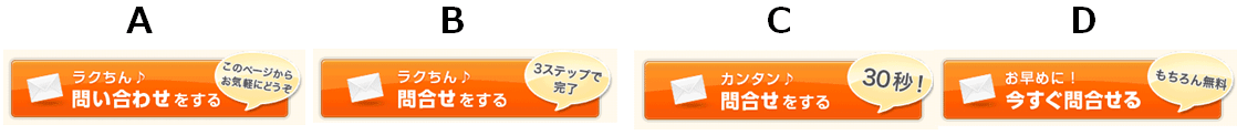
The answer is D.
Button D made sure to let the visitor know that there will be no charge for inquiries and that encouraged more people to do so.
There are four factors that lead visitors to target page:
- color
- size
- label (text)
- design
Suppose you can get three times more clicks by combining those factors above, you would still want to try several different patterns to find the optimal design. Unfortunately, the best design and patterns vary from site to site so there is no one size fit all solution here. We recommend trying various combinations and the conduct an A/B test for each one.
3rd improvement:
Have your homepage tell a story
So far we have discussed improvements on leading visitors to application forms. Finally, we will show the important factors when improving the homepage of the website.
If you only provide a single product or service, we recommend you take a landing page approach to designing your homepage. This is not the same as making a landing page.
For a landing page, you should eliminate any clickable buttons except for the conversion you want. If you do the same for the homepage however, it could damage your results on search engines.
Designing your homepage like a landing page requires you to incorporate a story line – along with all the usual buttons linking to other pages. By incorporating a strong story line to the homepage, the ratio of visitors reaching the conversion goal will be improved.
After all, who doesn’t like a good story?


As a result of changing the structure to a landing page style, the number of conversions for inquiries increased.
In our example, most of the incoming traffic flow was from the homepage. This is different for every website however so we recommend you focus on improving pages that gain the largest number of incoming traffic and has a high bounce rate. Analytic tools such as Google Analytics are great resources.
Creating a story line using PASoNA law
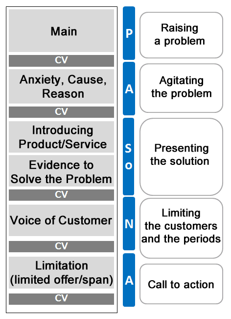 [Configurations of utilizing PASoNA law]
PASoNA is an acronym for a 5-step approach that can effectively encourage purchasing behavior in consumers. It’s a powerful too when telling an appealing story.
[P] Problem: raising a problem
[A] Agitation: agitating the problem
[So] Solution: presenting the solution and evidence backing it up
[N] Narrow down: limiting the customers and the periods
[A] Action: a call to action
…to be continued in “Part 3: Improving Your Website”


;>/img/banner/partner $url=>$index; .png)