 Login as
You understand the importance of web analysis but what do you focus on? It seems like there’s an endless number of things to do – reaching out to customers, proper SEO practices, and optimizing your website.
Each one of those things can grow into dozens more. You can’t do it all by yourself.
This is a case study recommended for people like you; busy people like you in charge of websites and want to make big improvements. In this article, we’re going to look at how a reform matching website increased sales by 200% in one year just by implementing 3 basic web analysis and improvement techniques.
This is the first part of our three part series for improving your website with three simple techniques:
- Part 1: Identifying the Problem
- Part 2: Testing Your Design
- Part 3: Improving Your Website
Identifying the Problem
A website that attracts customers but fails to convert?

[LIXIL, a housing renovation company]
LIXIL is a housing renovation company. They match those who want to renovate their houses to renovators.
When you apply for housing renovation through LIXIL’s website, you are presented with up to 5 different companies who meet LIXIL standards. You choose between the different companies and pick the one that best matches your needs. (See “renovation contact“)
The advantages of this website:
- You can communicate with renovation companies while maintaining your privacy through the website as a medium.
- You can talk to and compare up to 5 different companies at once.
- Declining proposals from companies is easy and impersonal.
- No need to worry about follow-up calls from companies so everything can be dealt with on the website.
The website has two main purposes:
To attract potential customers who are thinking about renovating their houses and convert them by having them apply for renovation through the website.
The problem? They were able to succeed in attracting visitors to the website through SEO and web advertisements but the number of conversions didn’t increase.
Why didn’t the number of applications increase?
There are two common reasons for why the conversions didn’t increase:
- The number of visitors are too low
- The number of exits on the website are too high
This might seem obvious but it often gets overlooked. Depending on the problem, the measures to take will vary.
- If the problem is having too little visitors, the solution could be to attract more through advertising, SEO implementations, and PR.
- If the problem is a having too many exits, the solution could be to improve the website in a way that better serves the customers and helps them reach their goals.
For LIXIL, the problem was a high exit rate.
Let’s break it down. Exit rates can be divided into three major categories:
- Bounce rate:
the rate of visitors viewing the landing page and then leaving from the website without viewing another page - Non-bounce exit rate:
the rate of visitors who do not bounce but do not reach the application form stage - Form exit rate:
the rate of visitors who do not complete the application despite reaching the application form
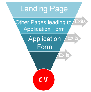
This image illustrates the conversion funnel.
Looking at the conversion funnel, you can understand how to increase the number of conversions by improving the exit rates. It’s also useful when doing the calculations.
For example, if the exit rate for each step is improved by 10% in all stages, the number of conversions will double in size.

Which exit rate should be improved first?
If you are making general improvements, the general rule is to focus on improving the weakest parts of the website, or the pages within it. That means if the heading and the content tabs are fine, but the page content is lacking, you need to improve from the bottom up starting from content.
Form exit –> Non-bounce exit –> Bounces (landing page)
For LIXIL it is better to improve things in the order above because form exit was the weakest link in this case. Taking that process and applying it to the actual pages, it looked like this.
Improve the application page –> Other pages that lead visitors to the application form –> Homepage
1st improvement:
Showing off value to customers by improving the website
Here are 7 ways to improve application forms;
- Minimize the number of items to fill out
- Do not force membership if it’s not necessary
- Make sure every item to be filled out is clear
- Make sure every item to be filled out is clear
- Make sure items to be filled out are updated in real time if there’s an input error
- Clarify which items are optional and which ones are required
- Do not specify character input with half-width and full-width options
We have to make sure we are conscious about these 7 points when designing our application forms.
Often times it is hard to minimize the number of items to fill out but be tough! Ask, “Are these forms really necessary to fill out or is it starting to feel like a survey?” Make sure every form item to be filled out serves a purpose and helps you provide value to the customer.
Remember, no one likes filling out online forms so make it as simple and easy as possible for the customer. Otherwise they’ll exit.

This is an example of renewing contact form.
…to be continued in “Part 2: Testing Your Design”


;>/img/banner/partner $url=>$index; .png)