 Login as
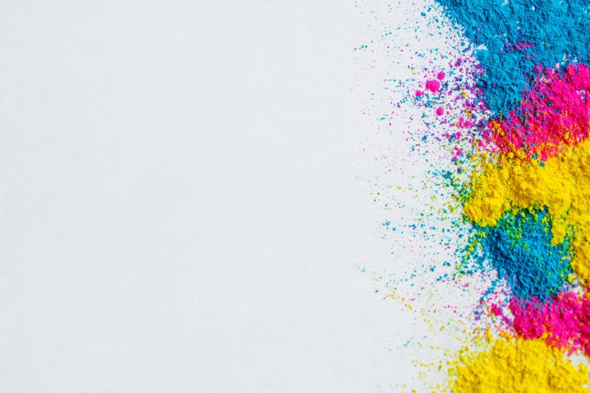
Choosing the right colors for the logo will show the strengths of your organization or company and help you attract the right clients. On the other hand, the wrong decision you make on your brand or logo color will give a big impact on your business.
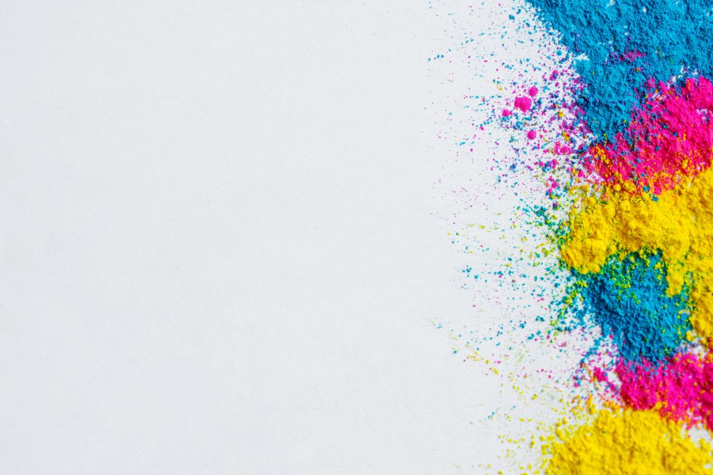
Everyone has heard about color psychology, which teaches us that our feelings and attitudes are impacted by colors. Some colors have a measurable effect on customers and others do not. The common question for a logo designer is “How could I choose the suitable color for my design?” and “Which color means what?”.
Green
A study reveals that green is not associated with many characteristics of brand personality, but has strong cultural associations. That implies you can use green for just about any kind of business.

Green is the color of nature, many individuals believe green is the color of creation or new life, and pregnant women were almost always painted green in the middle ages. However, a historical story and in some different cultures, green known as a color of death. Remember, green can fit with all kinds of brands.
Red
As you all know, RED is a symbol of arousal, passion, and rage. Red can make your brand stand out from the people, it brings out more playful, trendy, and youthful. It’s a powerful choice for your brand color.
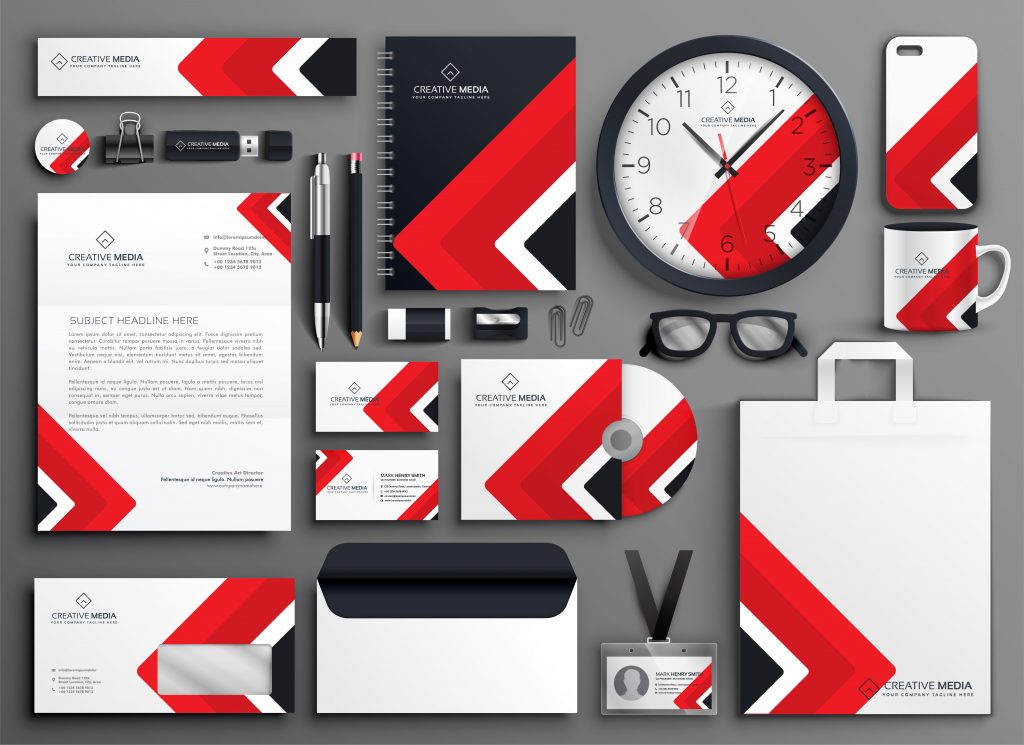
From the researcher, besides black and white, the first color that babies can see is red. Have you ever noticed, when people got the emotion of anger or passion, their faces turn red? Apart from emotion, red can be play to stimulate the appetite (food and restaurant logos).
Blue
Blue is the color of maturity, trustworthiness, and seriousness. Keep in mind that blue is a classic kind of primary color which means blue has been used by many brands all over the world. For this single reason, if you want to use blue for your brand, try to make it more attractive and stand it out from the crowd.
With all that said, when you want to exude classic confidence or ensure confidence in your business, choose blue for your brand.
Orange
Is your brand exists to bring people playful and joy? Not too far away, go with orange will bring your brand to the next level. Orange also brings the energetic punch out of it, whether it’s not at the red level.
Orange is not a primary color, it’s a combination of red and yellow. Use orange if you want to differentiate from the other.
Yellow
You get up in the morning, wipe your curtain, the first color that lights up your eye are yellow, the color of sunshiney friendliness, and cheerfulness.
Youthful energy will radiate through your brand. Most consumers, on the other hand, do not associate yellow with maturity or luxury products, so think twice if that’s how you want to see your business.
Yellow has been known as one of the first paint colors that ancient people were able to create. It brings joy to your customers.


;>/img/banner/partner $url=>$index; .png)